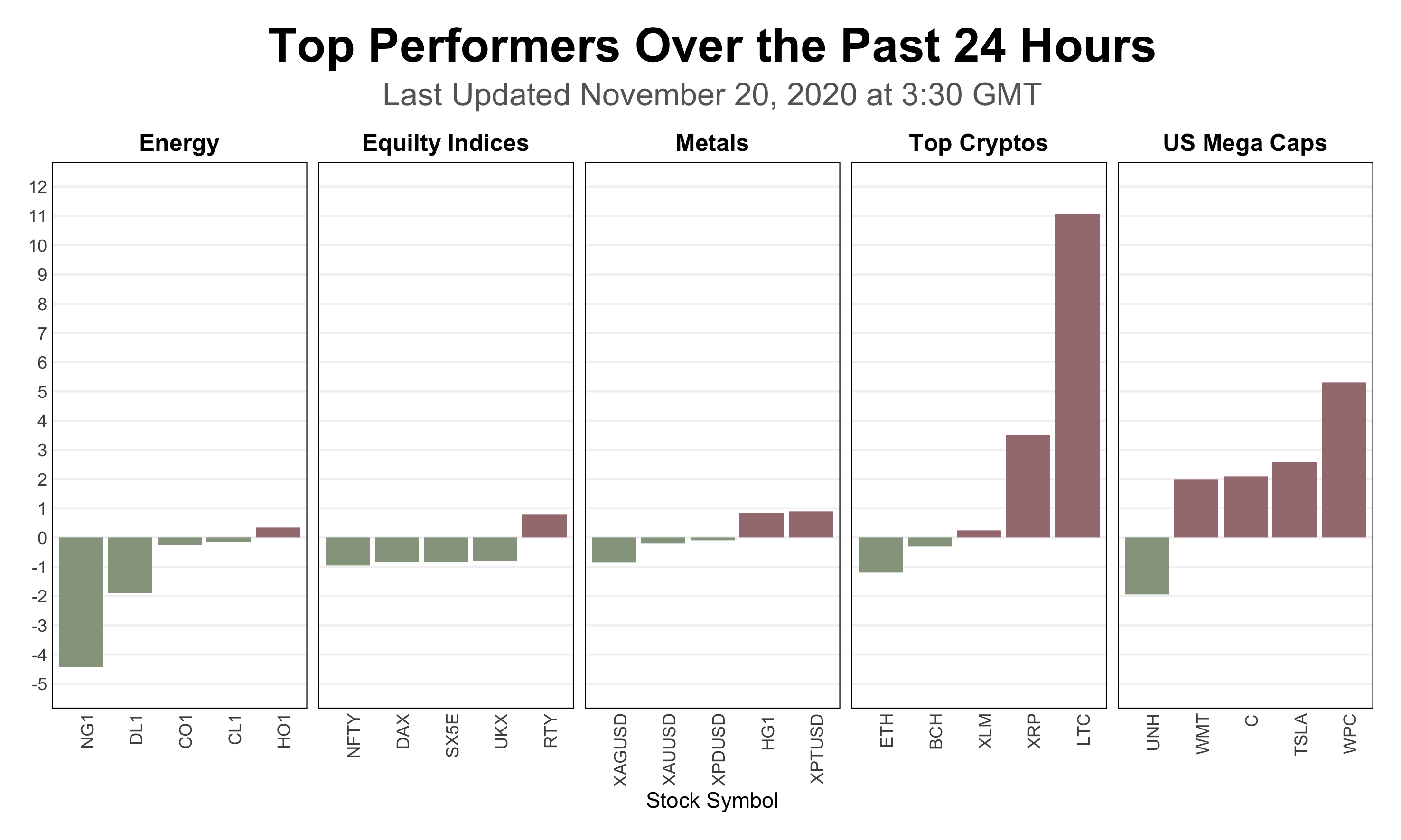
According to the article “top performers over the past 24 hours” in website World Markets Snapshot, there are 2 key points mentioned. In the first paragraph, the author summarizes the numbers in the category by averaging. Then, the individual stock performance followed. However, it is hard to tell the key points in the current version chart that is shown above. The 2 key points are:
- Which category performs the best/worst?
- Which individual stock performs the best/worst?
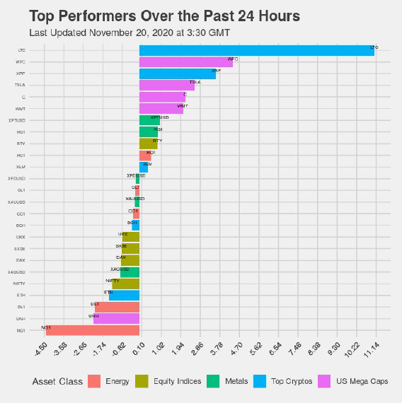
I design a bar chart to emphasize the 2 points. Here are my ideas:
- Separate the bar charts by the categories of stock, and
- Fill red and green colors representing increasing and decreasing respectively.
In this chart, it is easy to recognize which category performance better by the sum of the number of red bars and specify the best stock performance by finding the longest red bar.